How to Create a Theme Switcher in React
Apr 23, 2020Theme switchers have become more and more of a standard during the last few years. Mostly used as a night mode toggle. There are a wide variety of approaches for creating your desired effect, but some seem overly complex to get up and running for such a small task. With React we get some tools that makes the addition of a theme switcher very easy to implement and also manage with the componentization of our code.
This project can easily be followed with the basic create-react-app setup.
The final code can be found here - https://codesandbox.io/s/blog-theme-switcher-j0o2g
Lets start of by building a very simple switch component. I created a components folder in my project directory and nested a folder for our ThemeSwitcher component.
At first we create our component. This is just a very basic functional component. I downloaded two SVG icons from FontAwesome. We will later switch between these based on our theme state.
import React from "react";
import { ReactComponent as Sun } from "../../icons/sun.svg";
import { ReactComponent as Moon } from "../../icons/moon.svg";

const ThemeSwitcher = () => {
  return (
    <div className="switcher">
      <Sun />
      <Moon />
    </div>
  );
};

export default ThemeSwitcher;
We add a little bit of CSS to handle the sizing and that's it.
.switcher {
  width: 50px;
  cursor: pointer;
}

@media (min-width: 420px) {
  .switcher {
    width: 1.5rem;
  }
}
And lastly create a index.js file which main focus is to easily let us export our component. It also lets us import our CSS in a efficient way.
import "./ThemeSwitcher.css";

export { default } from "./ThemeSwitcher";
You can now import the Switcher component to the page where you want to display it or keep it in a wrapper if it needs to be shown on every page.
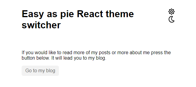
I created a few other elements, which we will use to show how the theme changes.
Right now our switcher doesn't do much and for one thing it doesn't even switch between the icons - lets fix that.
Adding a global state
For having an updatable state we will use the React context api.
With context we are able to create global state which is available everywhere in our app.
This of course entails that we use functional components. We could use class based components and a normal state, but that would mean we would have to prop our values, functions etc. down the component tree. This could lead to harder debugging and lessen our flexibility with the components.
Setting up the context api is dreaded by some, you have to keep track of providers and consumers. It can become a bit messy. Below I would like to introduce an approach for setting up a context without a big fuss.
Lets create a context folder in the project source folder and add our themeContext.js file. Here we first setup our base context without any default context state. Which of course would return us undefined when using the context.
import React, { createContext } from "react";
import PropTypes from "prop-types";

export const ThemeContext = createContext();
We could of course define our values inside the create context but we would lose a lot of functionality. Instead of using our context directly in our files and setting our state in that initial component, like a layout component or the like. But it is way nicer having all of our context logic in one place. So we create a ThemeContextProvider component below, in here we can setup states, global functions, variables etc.
So we setup our initial theme state and provide it to the context, thereby making it available to the children through useContext.
import React, { createContext } from "react";
import PropTypes from "prop-types";

// initialize our theme context
export const ThemeContext = createContext();

//setup a provider component, wrapped views, components etc.
// can access the context through here
export const ThemeContextProvider = ({ children }) => {
  const [theme, setTheme] = useState("light");

  return (
    <ThemeContext.Provider value={{ theme, setTheme }}>
      {children}
    </ThemeContext.Provider>
  );
};

ThemeContextProvider.propTypes = {
  children: PropTypes.oneOfType([
    PropTypes.arrayOf(PropTypes.node),
    PropTypes.node,
  ]).isRequired,
};
We export both the ThemeContext and the provider component from the file to access theme throughout the app.
Now we will wrap our app component with our provider in the index.js file. If you have multiple routes or the like, you should make sure to wrap them, so that the state is available in all the routes.
// ...
import { ThemeContextProvider } from "./context/themeContext";

const rootElement = document.getElementById("root");
ReactDOM.render(
  <React.StrictMode>
    {/* wrap the app component */}
    <ThemeContextProvider>
      <App />
    </ThemeContextProvider>
  </React.StrictMode>,
  rootElement
);
We are now able to use our context in all our child components. So head over to our switcher component to destructure our theme value and update function.
Setting up the logic
We'll add it to our wrapper div but we need to add some logic, so we'll configure an update function. This one will check whether or not the theme state is equal to "light", based on this we will either set the theme to "dark" or "light". We'll also show either the sun icon or the moon icon based on our state
import React, { useContext } from "react";
// ...
import { ThemeContext } from "../../context/themeContext";

const ThemeSwitcher = () => {
  const { theme, setTheme } = useContext(ThemeContext);
  const isLight = theme === "light";

  const updateTheme = () => (isLight ? setTheme("dark") : setTheme("light"));

  return (
    <div className="switcher" onClick={() => updateTheme()}>
      {!isLight && <Sun />}
      {isLight && <Moon />}
    </div>
  );
};

export default ThemeSwitcher;
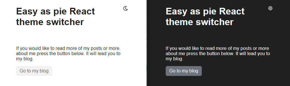
You can now switch between the two icons by updating our global context state.
To control the other elements of the page we will add our theme value to our outermost parent component. In our case the App.js file.
Adding styling to your app
You can either add the theme as a class property as we have provided it as string. We could also set it as a data-attribute, but I will go with the more traditional approach for now.
// ...
import { ThemeContext } from "./context/themeContext";

export default function App() {
  const { theme } = useContext(ThemeContext);

  return <div className={`App ${theme}`}>{/* ... */}</div>;
}
The next step is to setup our CSS and change styling when the .dark class is added to our base component.
.App {
  /* ...  */
  background: #fff;
  color: #202020;
  transition: all 0.2s ease-in-out;
}

.App.dark {
  background: #202020;
  color: #fff;
}

.button {
  /* ...  */
  background: #f2f2f2;
  color: #5f5f5f;
  transition: all 0.2s ease-in-out;
}

.dark .button {
  color: #f2f2f2;
  background: #6c737e;
}

.button:hover {
  filter: invert(10%);
}

.dark .button:hover {
  filter: invert(65%);
}
You should now be able to easily switch your theme based on the added class.
Great job but we can definitely improve our approach for changing the colors.
Adding a .dark property to all possible classes that need to change can become quit cumbersome, especially in larger applications. What if colors need to change suddenly, you would have to go through your whole app and adjust your colors one by one.
Optimizing with CSS Variables
Luckily CSS has given us variables, a very powerful way to have global CSS variables that can change on runtime, something that is not supported in the very popular Sass library.
First of lets define our variables at the top of the page. Ideally, in larger projects, you would ensure that these would be defined in your outermost CSS file to ensure that they are available throughout your whole application. Remember the file with your variables should be loaded in on every page.
:root {
  --primary: #202020;
  --secondary: #f2f2f2;
  --background: #ffffff;
}
Now can change the variables when the .dark class has been added. Doing this will overwrite our variables when the .dark class is added to our parent element.
This saves us from writing a lot of the same styling with minor changes.
.dark {
  --primary: #f2f2f2;
  --secondary: #2b2b2b;
  --background: #202020;
}
The last thing we have to do is switch out our hardcoded colors with our variables. We do that by adding var() and add the variable name within the parentheses.
.App {
  /* ...  */
  background: var(--background);
  color: var(--primary);
  /* ... */
}

.button {
  /* ...  */
  background: var(--secondary);
  color: var(--primary);
  /* ... */
}
Now we can quickly change our variables to anything we want and the app will respond.
Now if you are coding along you might notice that, with the approach above, we need to re-set our preferred theme each time we visit the page. If your page is a one-time drop-in that might be a-okay, but if you have regular users, they might grow tired of switching to their desired theme each time they visit your site.
Configuring for persisting theme through local-storage
So we need to somehow persist a users theme preference. Well you could setup user login and have it all stored in a database, but again that's a huge feat for just storing whether or not you like night mode. Instead we can take advantage of the users browser, where we have access to local-storage.
First up we can add a storeTheme function that handles both setting the theme to our global state as well as storing in the local storage. This will save us from writing the same logic twice, as we are doing the same thing on each side of the ternary operator.
Now instead of setting the global variable directly in the updateTheme function we can just pass in the string we want to store in both our state and local-storage.
Lastly we need to add a useEffect for checking if there is a theme value stored in our local-storage. If that is the case then we want to update our theme context with the stored value. We set an empty array as our dependency for the useEffect, to say, we only want this to run on its initial mount.
And that's it!
// 3
useEffect(() => {
  const persistantTheme = window.localStorage.getItem("theme");

  if (persistantTheme) {
    setTheme(persistantTheme);
  }
}, []);

// 1
const storeTheme = (themeValue) => {
  setTheme(themeValue);
  window.localStorage.setItem("theme", themeValue);
};

//2
const updateTheme = () => (isLight ? storeTheme("dark") : storeTheme("light"));
You will see small flash on initial load as the color switches, something that could be fixed in different ways for example with SSR but that's for another post.
If you are looking for some additional or supplementary reading on the topics covered in this tutorial, please take a look at the following links.